long <-data.frame(id =rep(1:3, each =2),variable =rep(c("x", "y"), times =3),value =c(3, 5, 4, 8, 3, 1))long
  id variable value
1  1        x     3
2  1        y     5
3  2        x     4
4  2        y     8
5  3        x     3
6  3        y     1
This dataset is in what is called “long” format. We have 3 individuals, with IDs 1, 2, 3. For each individual we have 2 variables, x and y, and for each individual and variable we observe the value in the value column.
If we want to reshape this dataset so that it has only 1 row per individual (3 rows in total), with the variables x and y as separate variables, we can use functions from the reshape2 package. Install the package with install.packages("reshape2"). You can use the dcast() function from this package to reshape the data as follows:
library(reshape2)wide <-dcast(long, id ~ variable, value.var ="value")wide
  id x y
1  1 3 5
2  2 4 8
3  3 3 1
The first argument is the name of the dataset. The second argument is the formula for how to reshape. We put the ID variable that we want to represent the rows first, then we use the ~ symbol, and then we put the variable with the different variable names. The third argument gives the name of the variable with the values.
20.2 From Wide to Long
We can also go the other direction. Let’s get back to our original data by reshaping the new wide dataset back to long. Let’s call the output long2. We can do that with the melt() function:
long2 <-melt(wide, id.vars ="id")long2
  id variable value
1  1        x     3
2  2        x     4
3  3        x     3
4  1        y     5
5  2        y     8
6  3        y     1
Again, the first argument is the name of the dataset. The second is the variable is the varying representing the observation IDs.
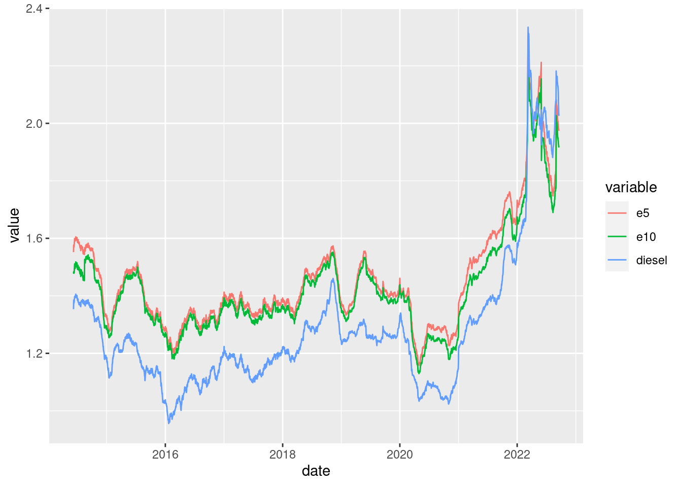
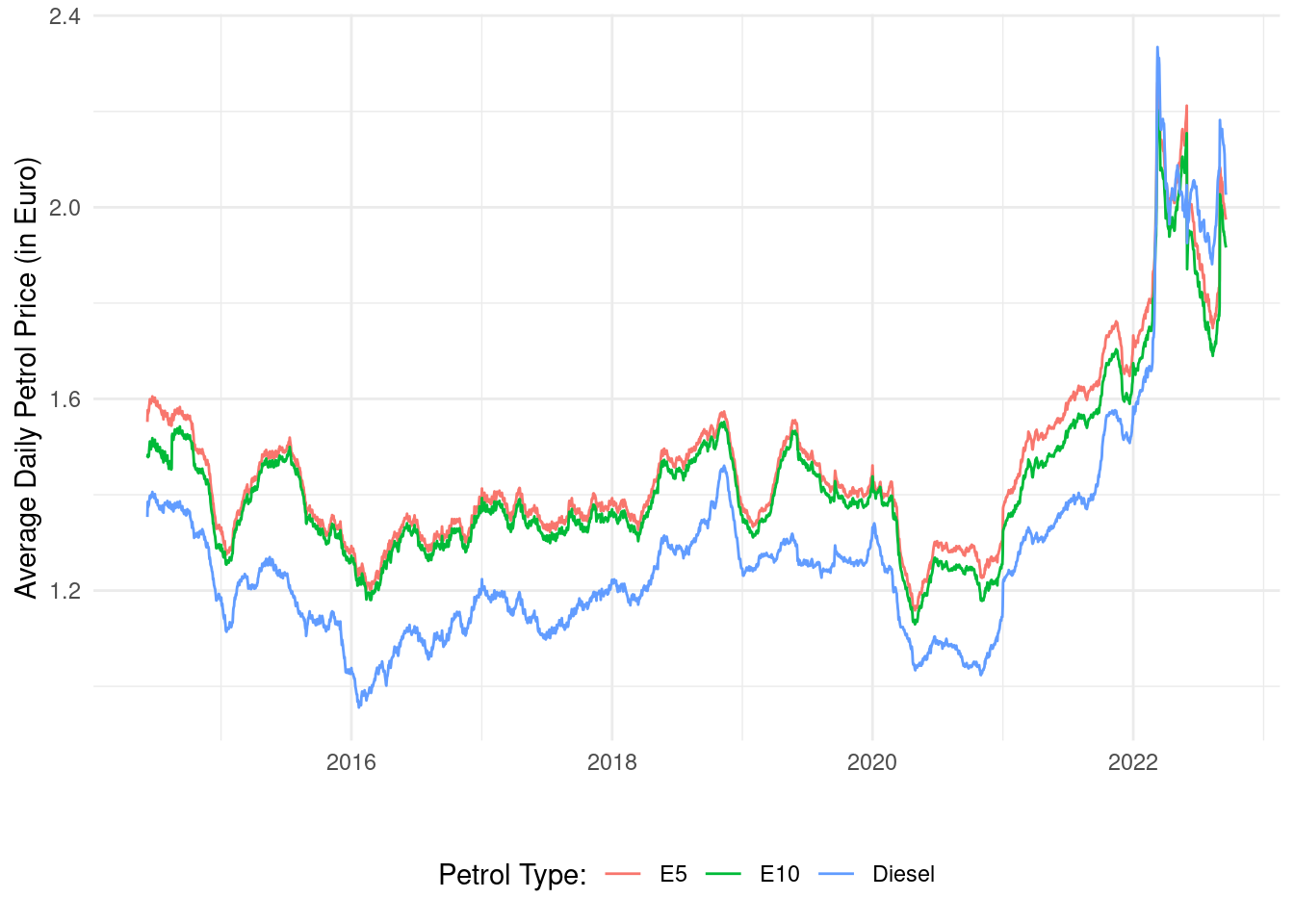
20.3 Example Usage Case
Sometimes with ggplot, we need to have the data in long format. This happens when we want to plot multiple variables on the same plot with different colors. Let’s use the petrol price dataset from Chapter 19 to demonstrate this:
# Read in and clean petrol price data:df <-read.csv("avg_daily_petrol_prices.csv")df$date <-as.Date(df$date) # format dateshead(df)
The dataset is currently in “wide” format. The date runs down the dataset and the variables (petrol prices) at each date are stored horizontally from this. Let’s go to “long” format with the melt() function, where "date" represents the observation IDs.