The S&P 500 is a stock market index that tracks the stock market performance of the 500 biggest publicly-listed companies in the US. The file SP500.csv contains the value of this index for each day from 2015 until 2023.
With ggplot, if you want to plot a variable x over time t from the dataframe df, you can use the command: ggplot(df, aes(t, x)) + geom_line().
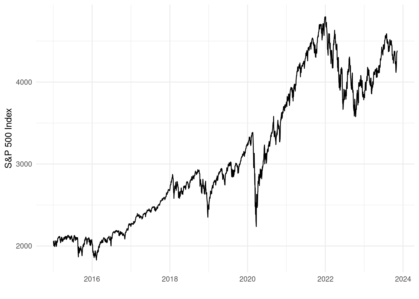
Use this approach to plot the closing price (variable close) over time.
Based on your plot, during which of the following periods did the index experience the largest crash?
We can see that the largest crash happened at the start of 2020 when the corona outbreak happened. There was also a big crash at the start of 2022, but this was not one of the possible MCQ options.
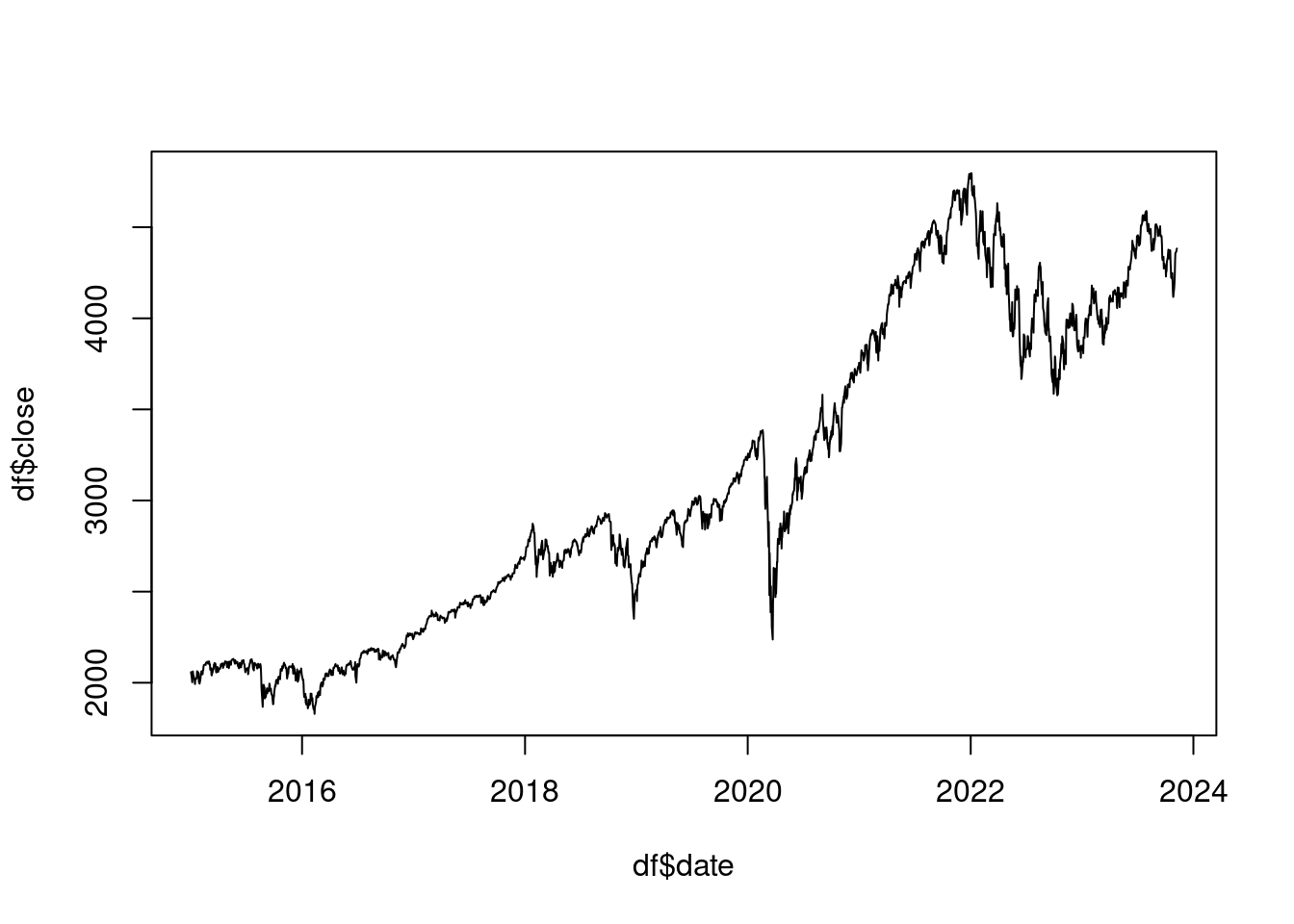
Just so you can see it, it’s also possible to make a line plot with base R. We just use the plot() function with both variables and add the type = "l" option, where "l" stands for line:
plot(df$date, df$close, type ="l")
Question 2
Using the S&P 500 data, create a variable in your dataset which is the percentage change in the closing price from one day to the next. Call this the daily return.
If x_t is the closing price on date t, then the percentage change in the closing price from the previous day is given by the following equation:
100\times \frac{x_t -x_{t-1}}{x_{t-1}}
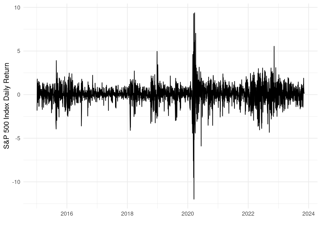
Plot the daily returns over time using ggplot with the geom_line() function.
Which of the following is true in the plot?
Early 2020 had both the biggest positive and negative daily returns.
Early 2020 had the biggest positive daily returns, but not the biggest negative daily returns.
Early 2020 had the biggest negative daily returns, but not the biggest positive daily returns.
Early 2020 had neither the biggest positive daily returns, nor the biggest negative daily returns.
Solution
To create this return variable, we first need to sort the data by date:
           date   close lag_close
2229 2015-01-02 2058.20        NA
2228 2015-01-05 2020.58   2058.20
2227 2015-01-06 2002.61   2020.58
2226 2015-01-07 2025.90   2002.61
2225 2015-01-08 2062.14   2025.90
2224 2015-01-09 2044.81   2062.14
Because we don’t have an observation before the 2nd of January 2015 we need to use NA for that value. For all subsequent values we use the value from the previous period. We index the vector from 1 to nrow(df) - 1 because for the very last row with index nrow(df), we use the value with index nrow(df) - 1 for the lag.
We then use this variable to create the percentage return variable according to the formula:
We can see that early 2020 had the largest swings in returns, where it had both the largest positive and negative daily returns.
Question 3
Download the dataset toyota-camry-ads.csv. This contains information on classified advertisements placed on Craigslist for used Toyota Camry cars, one of the most common sedan cars in the US. The variables are:
condition: what kind of condition the car is in (good, like new, etc).
odometer: how many miles the car has travelled in its lifetime (the car’s “mileage”).
paint_color: the car’s color.
price: the asking price of the car.
year: the year the car was bought new.
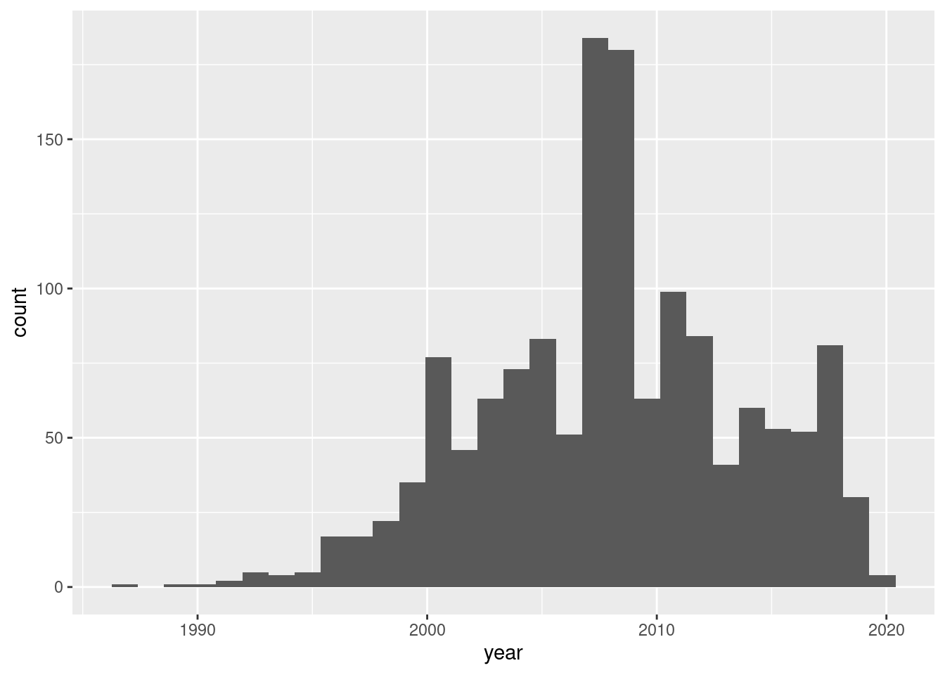
Create a histogram of the year variable. Based on this histogram, choose the answer below which contains a correct statement about the data.
The majority of cars in the dataset were bought after 2000.
The majority of cars in the dataset were bought between 2007-2009.
The majority of cars in the dataset were bought after 2010.
`stat_bin()` using `bins = 30`. Pick better value with `binwidth`.
We can see that most cars were bought after the year 2000. We can confirm this by checking the proportion of cars bought after 2000:
mean(df$year >2000)
[1] 0.8953975
About 89.5% of the cars were bought after 2000, which is a clear majority.
The other options are wrong for the following reasons.
Only 25.4% of cars were bought in 2007-2009:
mean(df$year %in%2007:2009)
[1] 0.2538354
Only 35.1% of cars were bought after 2010:
mean(df$year >2010)
[1] 0.3514644
A very small percentage (0.2%) were bought in 1990 or earlier, so it’s not true that all cars were bought before 1990:
mean(df$year <=1990)
[1] 0.00209205
Question 4
Create a bar plot of the condition variable. Based on this plot, what is the most common condition for Toyota Camry cars for sale on this site to be in?
Plotting tip:ggplot will by default order the “conditions” alphabetically. But sometimes it makes more sense for categorical variables like this to be ordered differently. We might want to order the bars from worst condition to best condition. We can do this by converting the condition variable to a factor variable and specifying the order we want:
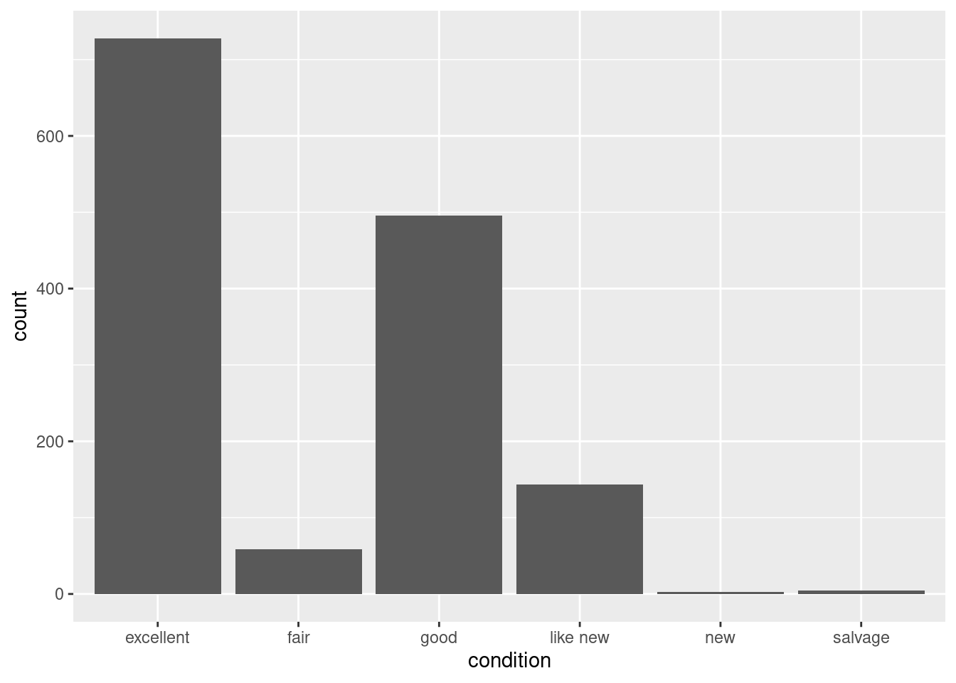
If we create a bar plot of the condition variable without ordering the levels, we get:
ggplot(df, aes(condition)) +geom_bar()
From this we can see that the most common condition for the cars to be in is “excellent”. But this is not a very satisfactory way of making the plot because there is a natural ordering to the condition types that isn’t alphabetical:
salvage < fair < good < excellent < like\;new < new
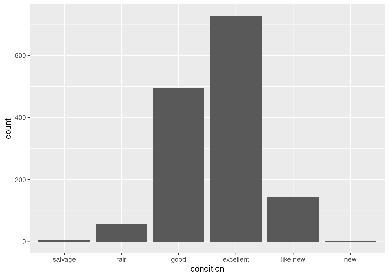
We can use the plotting tip to re-order the levels and re-make the bar plot:
Now the bars are in the right order. We still get the same answer to the question, however, that excellent is the most common condition for the cars to be in.
Question 5
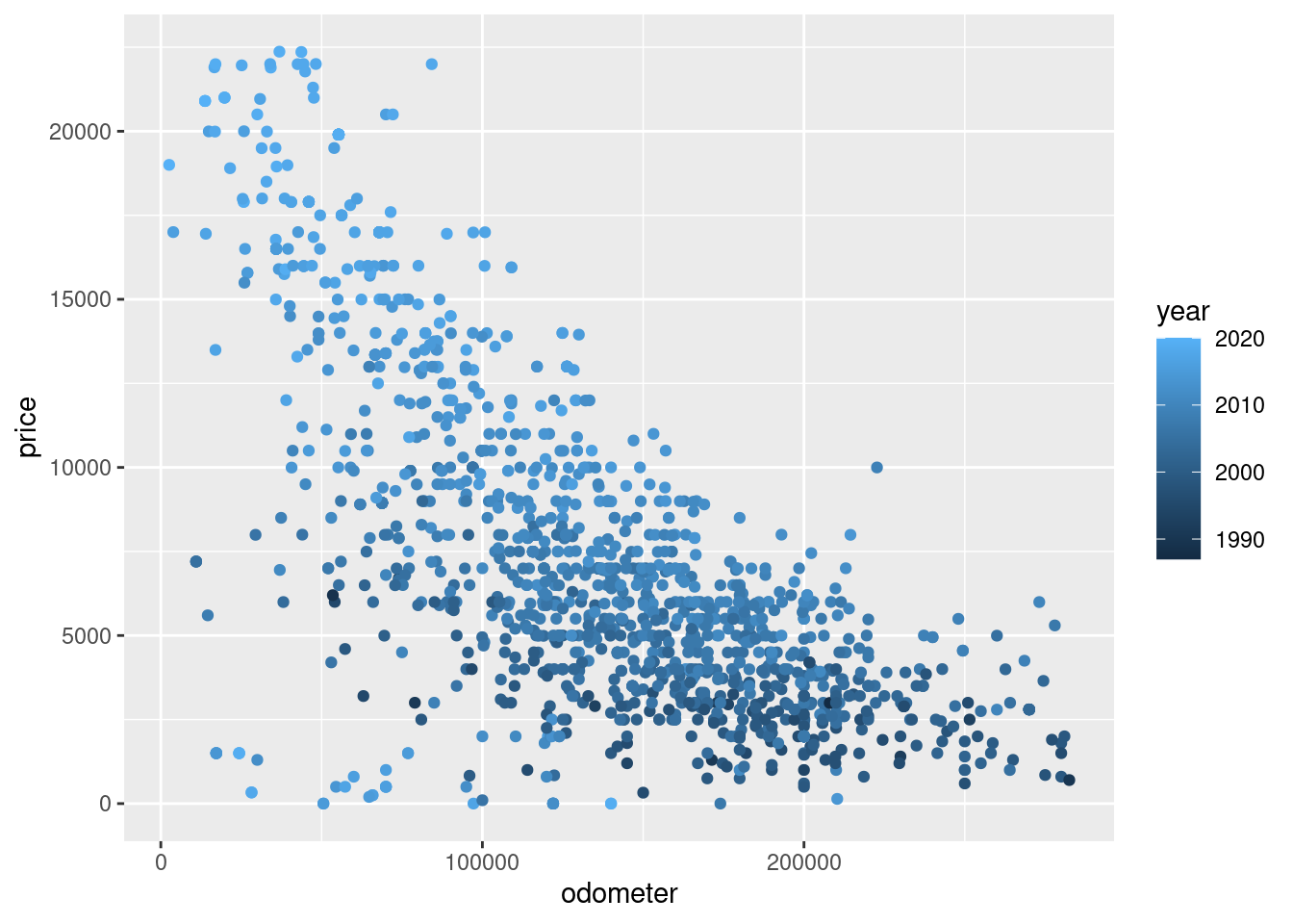
Create a scatter plot with:
odometer on the horizontal axis.
price on the vertical axis.
In addition, make the colors of the points represent the values of the year variable.
Choose the answer below which best interprets this scatter plot.
Hint: To make a scatter plot with x and y with colors representing z we do ggplot(df, aes(x, y, color = z)) + geom_point()
Higher values of odometer are usually associated with lower prices. In addition, newer cars usually sell for a higher price.
Higher values of odometer are usually associated with lower prices. In addition, older cars usually sell for a higher price.
Higher values of odometer are usually associated with higher prices. In addition, newer cars usually sell for a higher price.
Higher values of odometer are usually associated with higher prices. In addition, older cars usually sell for a higher price.
Solution
We create the plot as follows:
ggplot(df, aes(odometer, price, color = year)) +geom_point()
We can make the following conclusions from this:
Higher values of odometer means a lower price on average.
Lower values of odometer means a higher price on average.
Darker points usually have a lower price. Darker points are cars with a lower year, which are the older cars.
Brighter points usually have a higher price. Brighter points are cars with a higher year, which are the newer cars.
Therefore the option “Higher values of odometer are usually associated with lower prices. In addition, newer cars usually sell for a higher price” best matches what we observe.
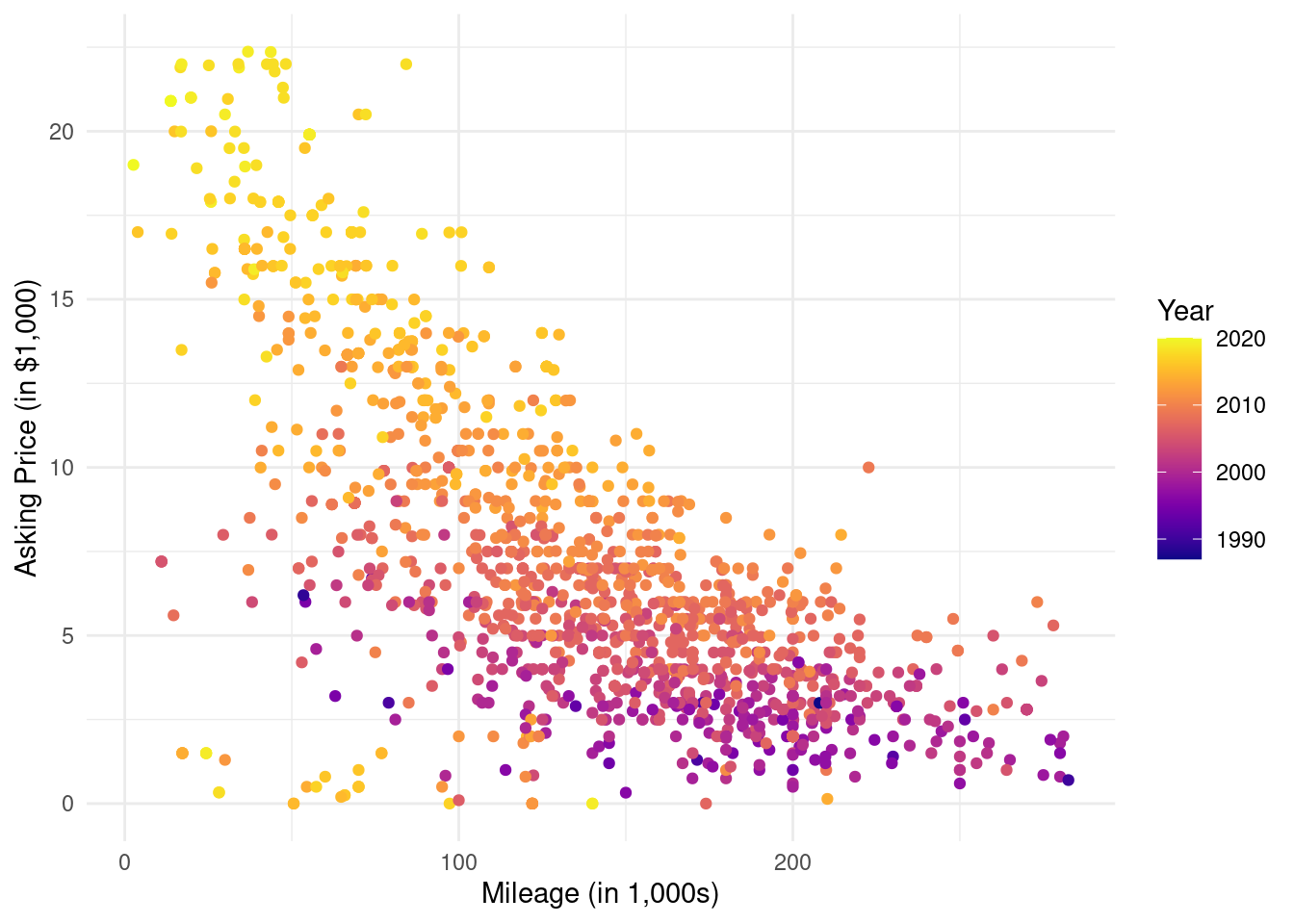
We can customize the plot a bit the following way:
if (!require(viridis)) install.packages("viridis")
Loading required package: viridis
Loading required package: viridisLite
library(viridis)ggplot(df, aes(odometer/1000, price/1000, color = year)) +geom_point() +xlab("Mileage (in 1,000s)") +ylab("Asking Price (in $1,000)") +scale_color_viridis(name ="Year", option ="C") +theme_minimal()
The line if (!require(viridis)) install.packages("viridis") checks if the package viridis is installed, and if it isn’t, it installs it. The viridis package is used to change the colors of the points. Note: you won’t be asked to use this package in the exam, but I’m just showing you how to use this package here in case you want to make colorful plots after this course.
The reason I divided the variables by 1,000 is to make them easier to read. We then adjust the axis labels accordingly to make this clear.